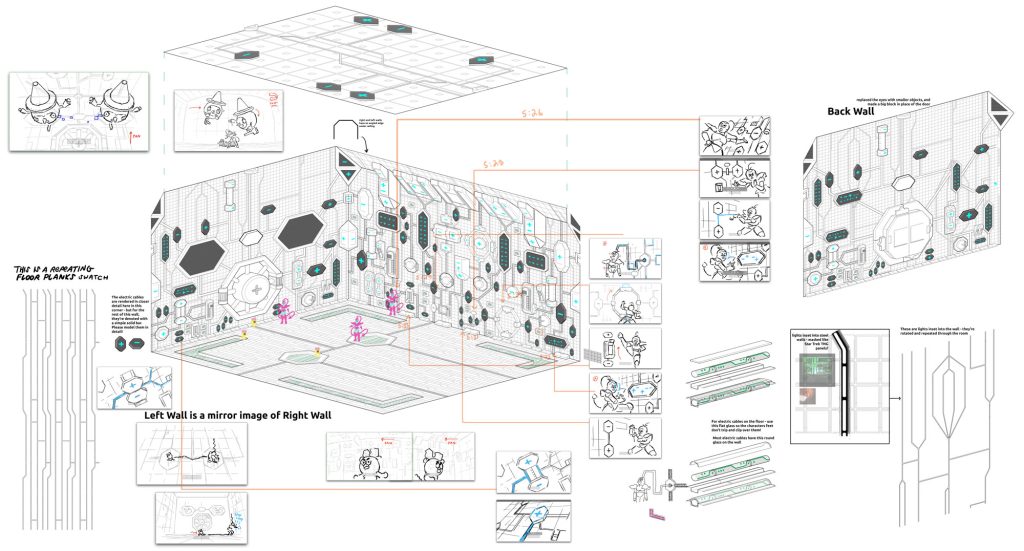
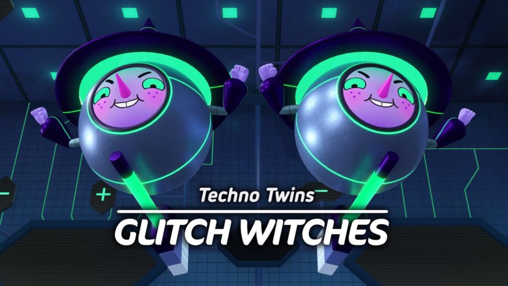
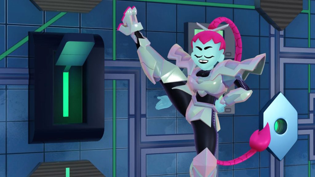
We designed so many huge, complicated environments for Battle Kitty. Exteriors were the hardest, but interiors had a lot going on, too. Here’s an arena I designed for the Dark Web Woods: The Glitch Witches Arena. Kitty and Zaza have to solve a riddle to escape.
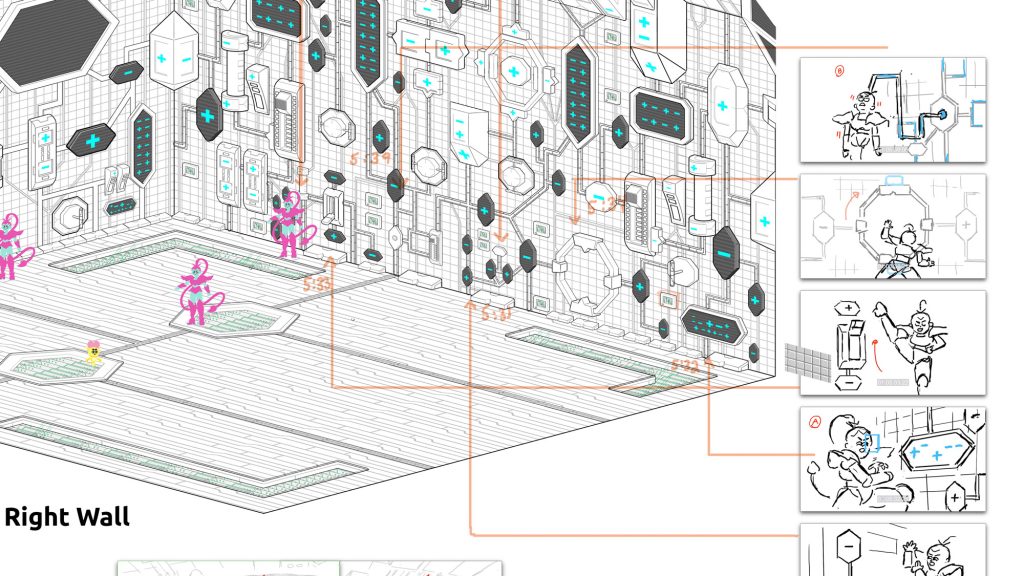

When we design these environments, we’re working after the storyboards have been finalized. So we can see everything we need to include, and we find a way to make all of the shots work. So you can see that we must include many specific shots from the animatic and show where that is happening. When the art director and showrunner are approving these BGs, they have to see that everything is there, that everything will work when animated. What’s visible in the closeups? The wide shots? Everything the characters touch must be there. Props have to be called out. Etc. Etc.
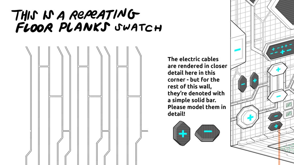
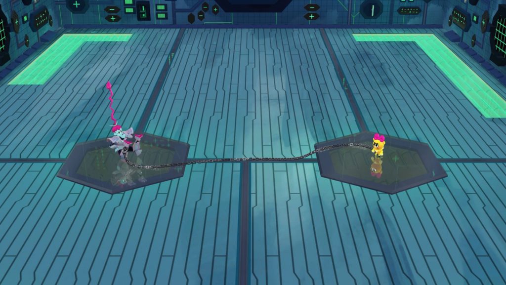
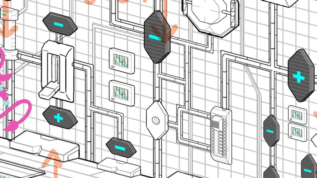
Working on a 3d show for the first time, I learned that text notes and photo references were super useful… sometimes much more important than a drawing we might make. I think in this environment I rendered things out more than I had to… putting them into isometic perspective when I didn’t have to. For example – the texture on walls could have just been included as a square texture reference. But in some cases I do think it was helpful – showing how everything fits together.
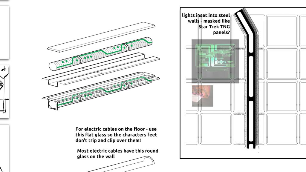
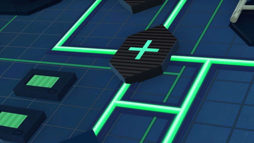
We tried to design architecture for all the corners and edges, especially the floor, since Kitty is so small and the camera shoots down at them a lot.
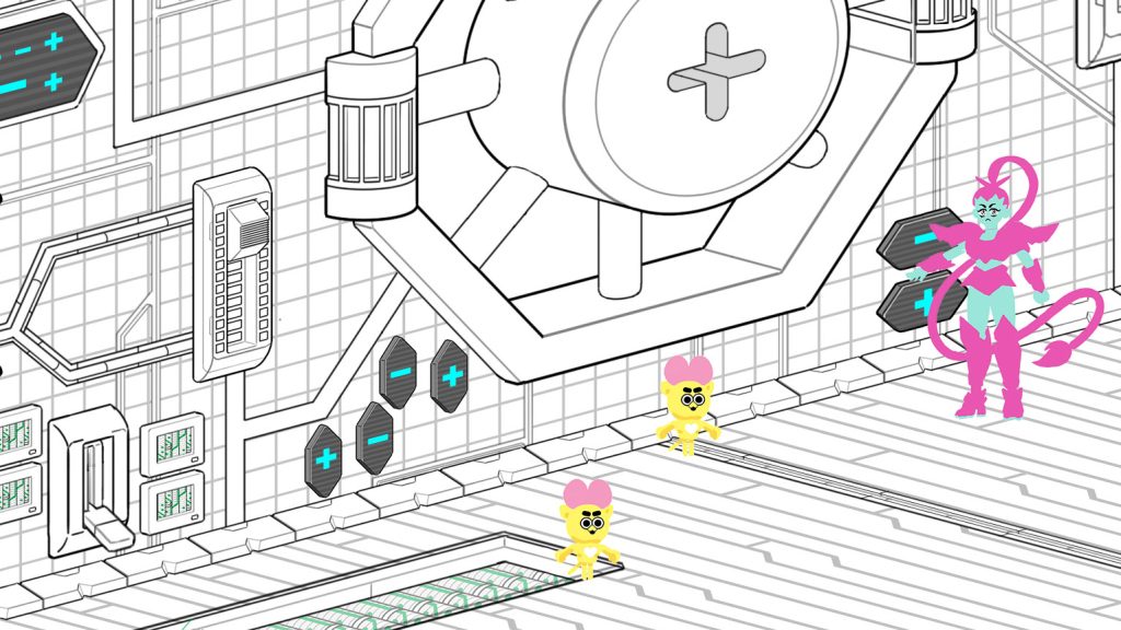
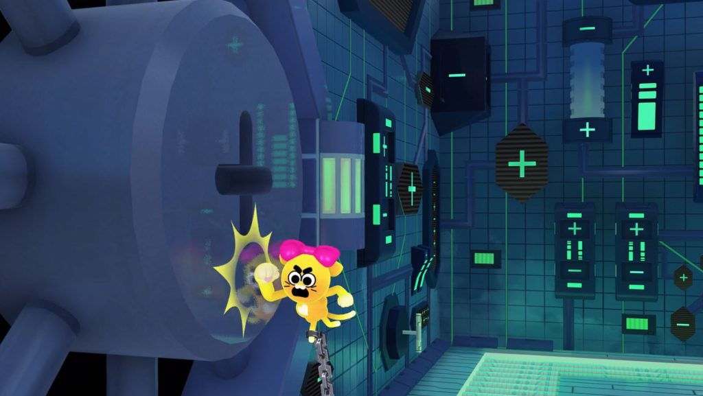
Some little details, I would almost forget. Like – the left and sides can be mirrored so you don’t have to draw both walls. But the back wall doesn’t have a door! So we added a new version with just a detail or two changed. No door and no big TV screens.
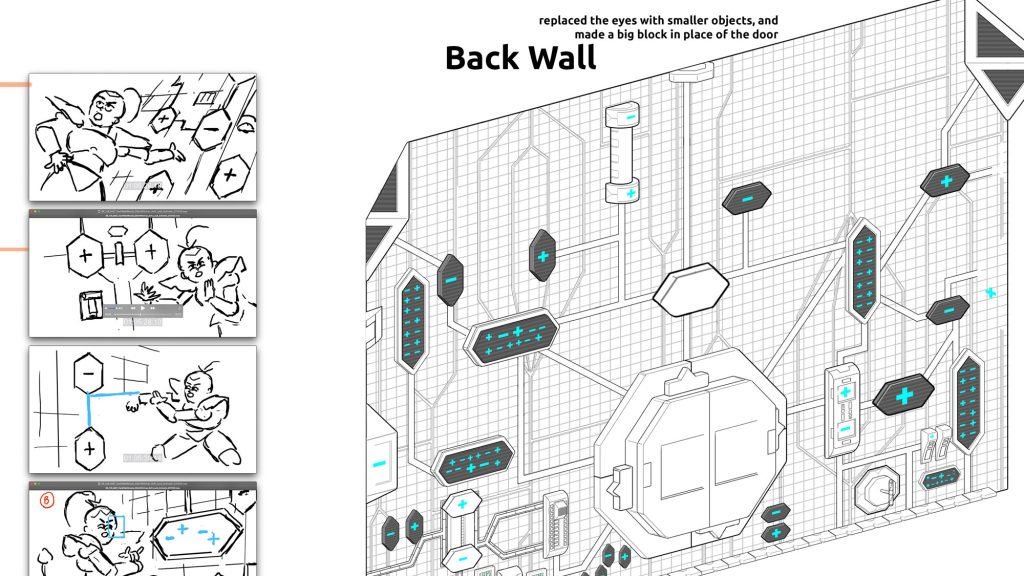
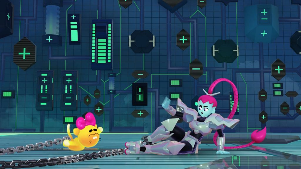
By the way – I love using Smart Objects in Photoshop. They have so many great uses, especially for designing in Isometric Perspective… And the point is, on a big set like this, a lot of stuff is being repeated. So I am happy that I’ve gotten better at creating and managing sets of multiple variations of the same object, flipping and rotating them to look natural and not too rigidly repeated.
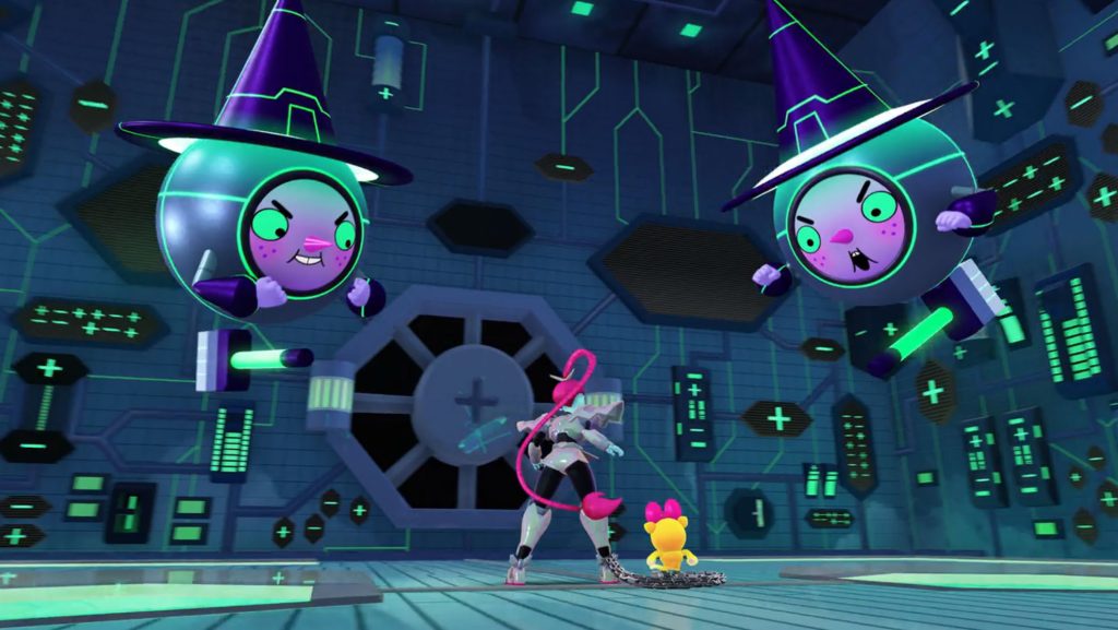
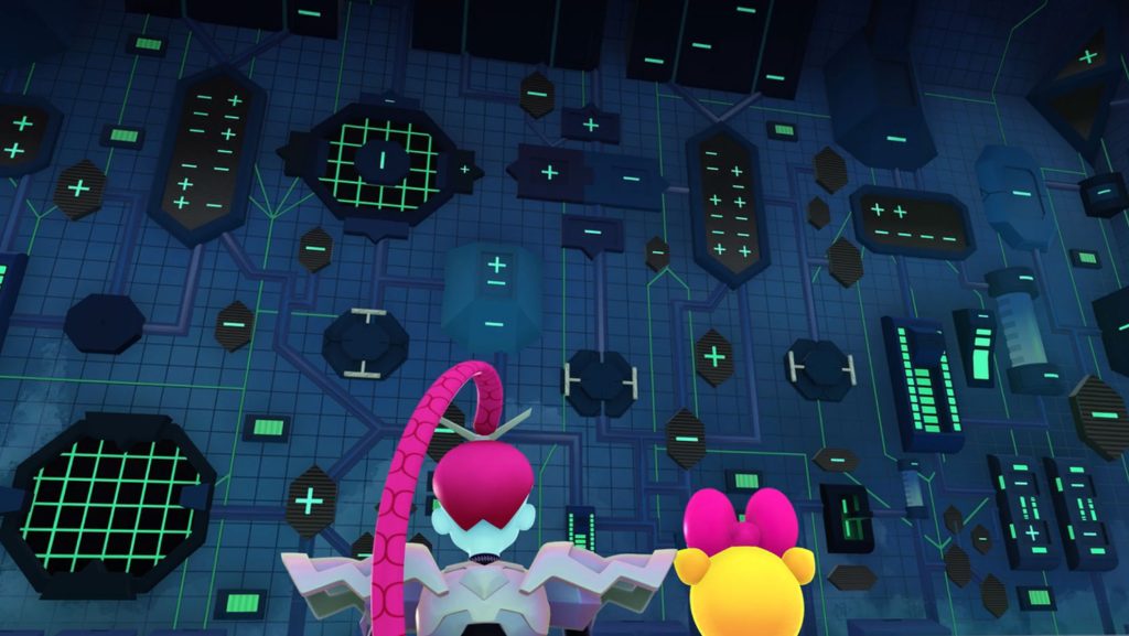
Overall, I am so proud of how this environment came out. This is pretty far into the show and we had figured out a lot… but we still had more to learn! I’m grateful to our BG painter William Gibbons for adding so much to this space. I’m also glad we had a good relationship with our counterparts at Plastic Wax, the 3D studio that created the environments from our designs. I love the effect of this finished episode. I hope you’ll check out Battle Kitty on Netflix!
